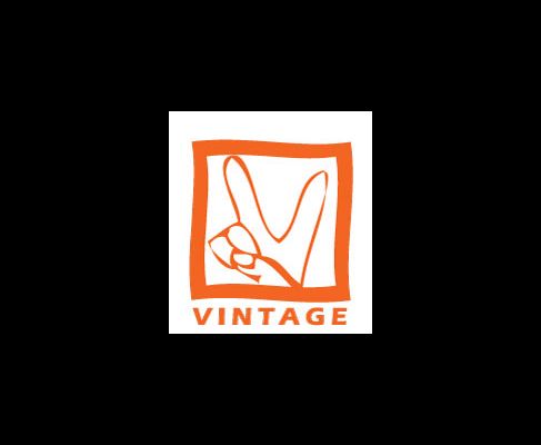
Give me some input on logo design. Here are 5 choices. Which ones do you like? This is an unscientific and unbinding poll, by the way. Thanks for your thoughts.
18 comments:
Anonymous
said...
I feel dirty for saying this but the first thing I thought of when I saw it was the Playboy bunny.
I am a big fan of the peace sign fingers - it communicates something about Vintage that I like. We are not a conventional church. We stand for more than Republican politics. We are willing to be a little edgy.
As far as the playboy bunny goes, I did not see the resemblance before, but I think it makes me like the logo even more.
By the way, I asked my 7 & 8 graders, and by far, they liked the second one best. Smart students of mine.
have to go with the 2nd one cause the other ones make me think I need to rock the vote or something and then I get this weird picture of you standing behind a pulpit saying "I am not a crook." and that's really no good too. Hey, maybe if you go with the ones that look like playboy signs, you'll get more people to check out vintage....just a thought.
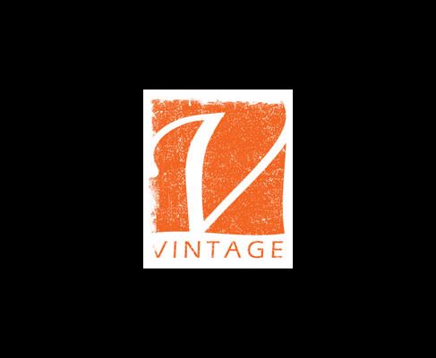
I am quite fond of the second one, followed closely by the third. Sometimes I like the last one a lot and other times not so much. I am not sure why. The word that comes to mind when I look at it is "Malibu," and once again, I am not sure why.
I am sure this is a possibility, but regardless of which one we go with, I am hoping we can get the V isolated as well so that we can use it independently of the whole word "vintage." Does that make sense?
and hey, whatever prints you don't use, you can just wear around to show your support for Vanessa hahahaha....comeon, I'm not the only one who thinks it's a pretty funny coincidence, right?


18 comments:
I feel dirty for saying this but the first thing I thought of when I saw it was the Playboy bunny.
i think we have a winner!
btw, choice number 2 is my favorite.
hmmm
#2 really is the theme of my life.
I like the plain v..the finger thing..well..it um..just is a tad weird..cross between President Nixon and hippy peace sign...and >I dont know what.
NOT BINDING OPIONION***
Maybe its my sign language background I don't know....
I thought playboy as well for the fingers. I really like the "v".
I really hope your asking for opinions and not looking for afirmation. Sorry.
I am a big fan of the peace sign fingers - it communicates something about Vintage that I like. We are not a conventional church. We stand for more than Republican politics. We are willing to be a little edgy.
As far as the playboy bunny goes, I did not see the resemblance before, but I think it makes me like the logo even more.
By the way, I asked my 7 & 8 graders, and by far, they liked the second one best. Smart students of mine.
have to go with the 2nd one cause the other ones make me think I need to rock the vote or something and then I get this weird picture of you standing behind a pulpit saying "I am not a crook." and that's really no good too. Hey, maybe if you go with the ones that look like playboy signs, you'll get more people to check out vintage....just a thought.
Just for comparison sake:
The Playboy Bunny
The Renegade Playboys logo
Rock the Vote logo
I like it!!! you should change the name of the church to the renegade playboys!!! Now that's emergent!!
boozqp--the quip I made about the cow pitcher
The last one is my favorite, followed closely by #2.
I am quite fond of the second one, followed closely by the third. Sometimes I like the last one a lot and other times not so much. I am not sure why. The word that comes to mind when I look at it is "Malibu," and once again, I am not sure why.
I am sure this is a possibility, but regardless of which one we go with, I am hoping we can get the V isolated as well so that we can use it independently of the whole word "vintage." Does that make sense?
and hey, whatever prints you don't use, you can just wear around to show your support for Vanessa
hahahaha....comeon, I'm not the only one who thinks it's a pretty funny coincidence, right?
At first glance I liked number one, but on reflection I think number two is a better fit. I like the feel of the license plate.
The V in the last one would be easily isolateable.
=)
qqaunpv = isolating the V in vintage for marketing purposes.
Another thought just dawned on me. Robb, do you like these even more because they happen to be Cleveland Browns orange? What a coincidence!!
Umm... about number two: is this going on letters or is it for a license plate?
I finally figured it out....Mohegan Sun.
that's what the last one looks like. The Mohegan Sun sign.
it's a casino.
Post a Comment